Artikel
5 Great Email Marketing Campaigns That Blew Away Audiences
28 Jul 2022 • Bacaan 4 minit
Email marketing is a science; once you understand the steps, anyone can build a successful email marketing campaign from scratch. We’ve offered some great tips and tricks which you can read up on in our previous blogs, but perhaps you’re looking for a bit of inspiration. Ignite a spark of creativity to help you on your way.
When it comes down to it, great marketing is about storytelling. Knowing the message that you want to deliver to your audience and how best to deliver it will bring you most of the way. And like every great story, the best email marketing campaigns have gone out countless times in different ways over the years to suit the time and place. Whether you’re a B2B business looking to secure tough clients in a competitive market or an up-and-coming online shop that wants to announce yourself in a big way to your customers, there’s something out there worth learning from that’s already make an impact with its audience. One worth adapting into your own campaigns.
Here are five great email marketing campaigns that worked for their brands.
Grammarly – New Product Launch
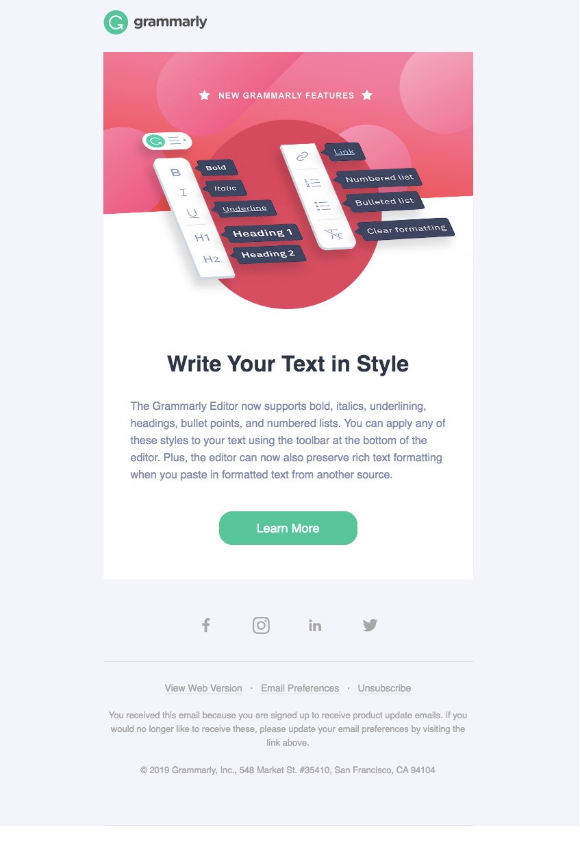
Popular grammar checking tool Grammarly is no stranger to doing product updates, and understands the need to communicate to its users when it rolls something fresh and shiny from its production lines. This extends to even small, quality of life updates such as the addition of a style editor in their product; including support for bold, underline, italics, indentations and more.

The graphics are simple but eye-catching; telling users exactly what they need to know about the message. The headline is catchy and large enough to emphasise the messaging. The body of the campaign is kept short and concise, directing users with a well-placed CTA to Learn More and access the site, driving conversions.
All this to say that Grammarly hit a home run with simple rules. They understand that readers do not want to spend too long on an email deciphering its contents. With emails trending in mailboxes at an all-time high and attention spans getting lower and lower each day, this short, punchy email did what it needed to do: Respect the user’s time.
Takeaway: Make sure your emails do not outstay their welcome. When in doubt, apply KISS: Keep It Simple, Stupid!
Meltwater – Year-End Roundup
The end of the year is fast approaching (as we write this) and you will likely have plenty of stories to tell and things to reflect on that you may want to share with your customers. A great way to do this is with a year-end roundup like Meltwater has done in this example. And as far as round-ups go, this one knocks it right out of the park.

The personalised message at the very beginning summarises the Meltwater executive’s wish for its customers in the upcoming year. The tone is warm and thankful to their customers, hoping for further engagement while upholding the brand as trusted and secure in its future.
Following that is a simple set of CTAs to different features the product offers, directing customers to the appropriate service to suit their needs. Note the clean layout with two columns that alternates between image and text to break the monotony of the messaging. While this campaign is longer than the previous one, the use of sections means customers can skim through quickly and find a feature that interests them most. Everything is tied together with the brand’s signature teal; from the banner to the buttons.
Takeaway: There are several good practices here, but I’d like to focus on one key point: Formatting is everything. Keeping your campaigns neat and tidy can help keep your customers interested.
Lou & Grey – Sales Campaign
The bread and butter of most online (and offline) stores, sales announcements are desirable to customers looking to save a ringgit on their purchases. Most of them include product displays with links to their respective store items. While effective, they also require a little more effort on your part to ensure everything is curated just right. Here’s a quick, simple way of making your customer get up and take action.

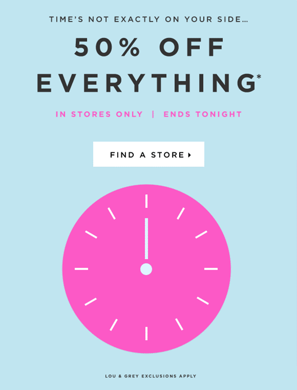
Lou & Grey induces the Fear of Missing Out (FOMO) in its customers with nothing but a simple graphic indicating that time is indeed running out. The copy is short and crisp, letting customers know what deals they’ll be getting, that they can only enjoy these deals by visiting a physical outlet and providing them with a link to find the closest shops to them.
Distilled to its most basic function (which this campaign does its very best to do), campaigns are all about getting your audience to take action. The better a campaign is at converting its customers, the more successful it is. And there’s nothing more powerful than good old-fashioned FOMO to do the trick.
Takeaway: Make your customers act by injecting the FOMO factor into your campaigns.
Artifact Uprising – Survey
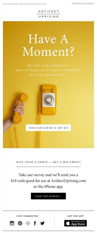
You will occasionally want to send your audience surveys; whether to gauge their interest levels to your marketing or products, or learn about any underlying concerns they may have regarding your brand. These are a great method of collecting customer feedback and finding out what worked and what didn’t for future reference. The clincher comes in motivating your customer to take some time out in their day to complete the survey for you. Here’s how Artifact Uprising did it.

Simple and to the point, the key to getting their users to complete surveys was to offer them a little something in return: store credit. Customers love being rewarded, and are more likely to act on a survey if there’s something in it for them at the end. If you’re looking to do survey marketing for your brand, this is a great way to ensure you have all the data you need.
Takeaway: Motivate your customers to act on campaigns with rewards. They’ll thank you for it!
Forever 21 – Sales Campaign
Another unique way of doing sales campaigns is by engaging your users with fun and unique mechanics.

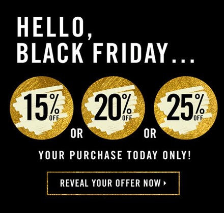
Instead of a straightforward announcement, Forever 21 builds the excitement by offering their users scratch cards in their emails. Users unveiling these cards will then be presented with their prize, giving them a sense of accomplishment while inducing FOMO (always important) to use their prize and not miss out.
Takeaway: Emails can be more than just static images. Play around with your campaigns and find creative ways to deliver your message.
Still looking for more inspiration? We’ve got you covered! Enginemailer offers over a hundred ready-made templates for you to choose from and customise to your liking! We give you the tools you need to wow your audience and keep them hooked for life. Sign up on our Free Forever plan today and send up to 10,000 emails a month.
This article was contributed by Enginemailer.
Dialog Komuniti
Ingin menyertai perbualan?
Daftar sekarang dan suarakan pendapat anda!

Dalami topik yang menjadi keutamaan anda


Interested in more helpful content?
Just sign up to access it all: a wealth of exclusive business insights, events you can attend and so much more!
Daftar sekarang